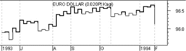


Overview : Kagi charts are believed to have been created around the time that the Japanese stock market began trading in the 1870s. Kagi charts display a series of connecting vertical lines where the thickness and direction of the lines are dependent on the price action. The charts ignore the passage of time.
If prices continue to move in the same direction, the vertical line is extended. However, if prices reverse by a “reversal” amount, a new kagi line is then drawn in a new column. When prices penetrate a previous high or low, the thickness of the kagi line changes.
Kagi charts were brought to the United States by Steven Nison when he published the book, Beyond Candlesticks.
Interpretation :
Kagi charts illustrate the forces of supply and demand on a security:
1- A series of thick lines shows that demand is exceeding supply (a rally).
2- A series of thin lines shows that supply is exceeding demand (a decline).
3- Alternating thick and thin lines shows that the market is in a state of equilibrium (i.e., supply equals demand).
The most basic trading technique for kagi charts is to buy when the kagi line changes from thin to thick and to sell when the kagi line changes from thick to thin. A sequence of higher-highs and higher-lows on a kagi chart shows the underlying forces are bullish. Whereas, lower-highs and lower-lows indicate underlying weakness.
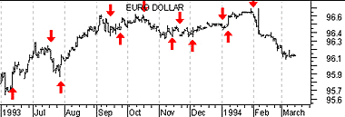
Example : The following chart shows a 0.02-point kagi chart and a classic bar chart of Euro Dollars.