


In this article I will introduce a new style of Ichimoku using a modified candle. This new style Ichimoku is more visual and much easier in determining the trend. Modified candle is the same as an “Averaged Candle Chart” so called “Heikin Ashi” in Japan.
“Heikin Ashi” was introduced by a commodities trader, who made a fortune using this chart. While skills and experience is needed to read a standard candle chart, a modified candle helps you to read a trend much easily. Let’s illustrate this using Charts A and B.


Charts A and B are EUR/USD from April 1 to June 30, 2003. Chart-A is a standard candle and Chart-B is a modified candle. First impression will be that Chart B candles are simpler than Chart A. Allow me to illustrate. First examine the up trend from early April to early May marked as the upward sloping red arrow (1) between these two charts. Candles of Chart A are mixed during this period and it is difficult to read the formations without at least some basic knowledge of candle charting. On the other hand
candles of Chart B are just a series of positive candles and they simply show EUR/USD in an up trend. Especially after late April, no negative candle appeared in Chart B and it indicates a strong up trend in this period.
Let’s see some more examples – the up trend from mid to late May marked by the red arrow (2) and the down trend from mid to late June marked by arrow (3). In both periods, Chart B gave a much clearer signal of the trend than Chart A. The advantage of modified candle is even more obvious during the consolidation period marked by a red ellipse (i) on both charts. Chart A has mixed candles but on the modified candle Chart B, there are only a series of short candles with shadows on both sides, an indication of consolidation.
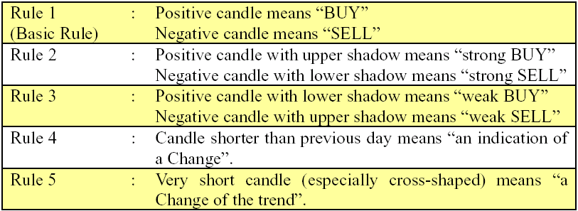
In summary, there are only 5 simple rules for modified candle and they can be easily remembered:
Modified candle chart works not only on daily chart but also on weekly and monthly charts. Analyzing from longer term chart to shorter term chart makes clear the current trend.
How to calculate this modified Candle? It is simple as well. Look at the sample Excel worksheet (Table 1).
Table 1: Modified Candle Calculations


